︎︎︎︎︎︎︎︎︎
NACHONACHO︎︎︎NACHONACHO︎︎︎NACHONACHO︎︎︎NACHONACHO︎︎︎NACHONACHO︎︎︎NACHONACHO︎︎︎NACHONACHO︎︎︎NACHONACHO︎︎︎
NachoNacho
2020-2021
[UI/UX]





Overview
NachoNacho is a fin-tech B2B SaaS management platform and SaaS marketplace.
I completed all design-related tasks prior to their first seed round of funding.
Specifications
- Work for the company included: UI/UX, front-end web development, marketing assets for social media, preview images, illustrations, and icons.
-
Branding and identity work was overseen directly by the CEO.
- Implementation of designs was done directly with the CFO.
-
Marketing and asset mangment was done in collaboration with my manager, and the marketing interns.
Environment
Due to a post-seed funding rebrand, I do not have access to files relating to UI/UX and web development.
Instead, the following sections will look at design principles and UI/UX solutions that were carried over from my previous work to the current identity.
BACKGROUND︎︎︎BACKGROUND︎︎︎BACKGROUND︎︎︎BACKGROUND︎︎︎BACKGROUND︎︎︎BACKGROUND︎︎︎BACKGROUND︎︎︎BACKGROUND︎︎︎BACKGROUND︎︎︎BACKGROUND︎︎︎
[Background]
Redesigning the front-end web experience and web app was initiated from a mobile app design I proposed.
- NachoNacho’s main focus at the time was scaling, improving, and preparing for funding.
- With fundraising on the horizon rapid development and improvement was a priority.
- This meant adjusting and updating branding, UI/UX, and creating new pages gradually throughout iterations.
UI/UX PROCESS:
1. Organize ︎︎︎ 2. Analyze + Prioritize ︎︎︎ 3. Iterate ︎︎︎ 4. Launch ︎︎︎ 1. Organize ︎︎︎ 2. Analyze + Prioritize ︎︎︎ 3. Iterate ︎︎︎ 4. Launch
1.Oragnize
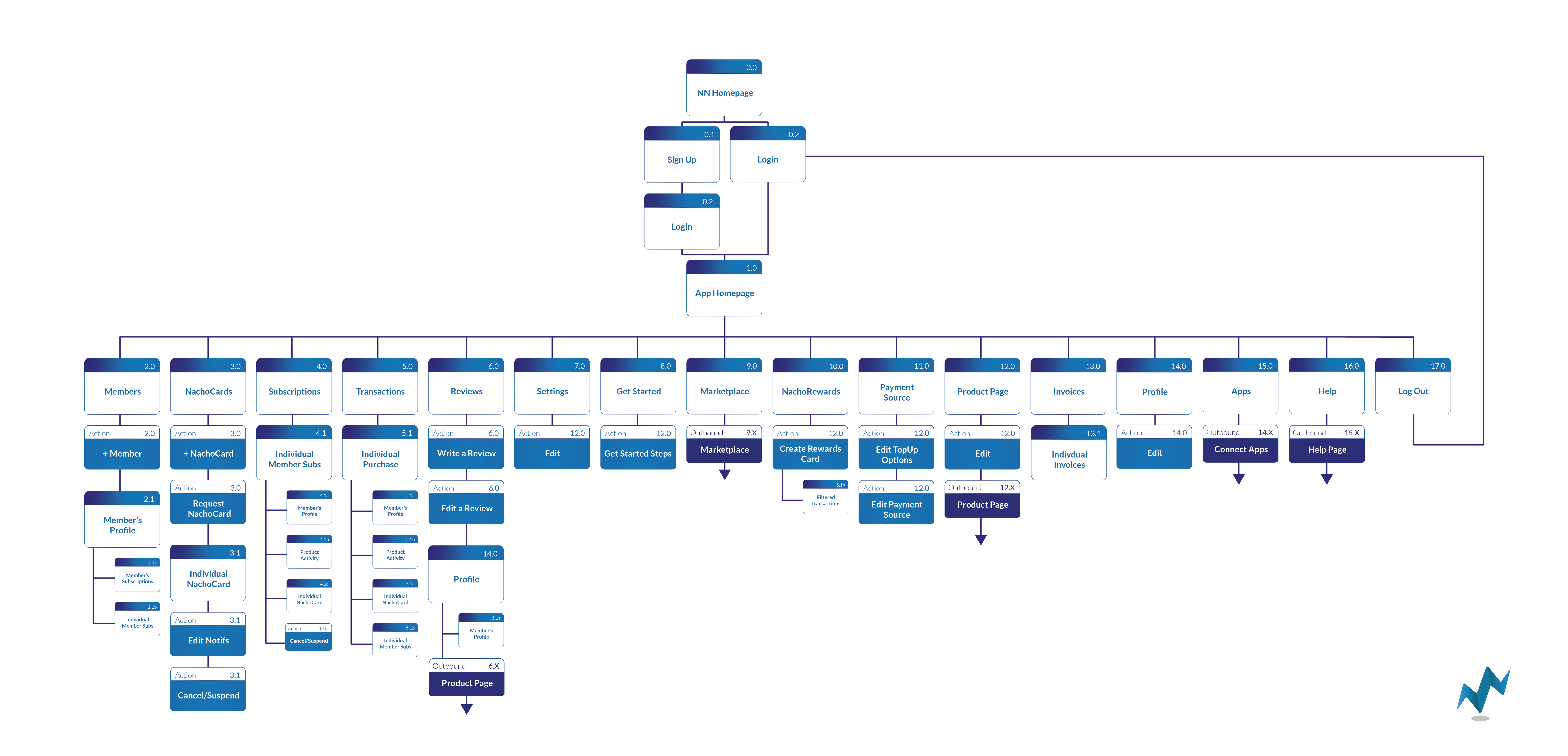
After using the web app for some time, I mapped out all current pages, actions, and links to other areas of the site.
This allowed me to identify overlapping functionality necessary in the UI across different pages as well as better understand a user’s journey.
This allowed me to identify overlapping functionality necessary in the UI across different pages as well as better understand a user’s journey.
2. Analyze + Prioritize
Analyzed click heatmaps for behavioral tendencies.
Developed a priority order for features needing improvement.
︎︎︎
This was informed mainly through live onboarding demos our CEO conducted with companies joining the platform.
Developed a priority order for features needing improvement.
︎︎︎
This was informed mainly through live onboarding demos our CEO conducted with companies joining the platform.
3. Ideate


Sketched layouts and interface adjustments
Wireframed new features and main UI ︎︎︎
[top nav bar, card styling, buttons, and side menu]
Created high fidelity mockups with alternative design solutions for A/B testing
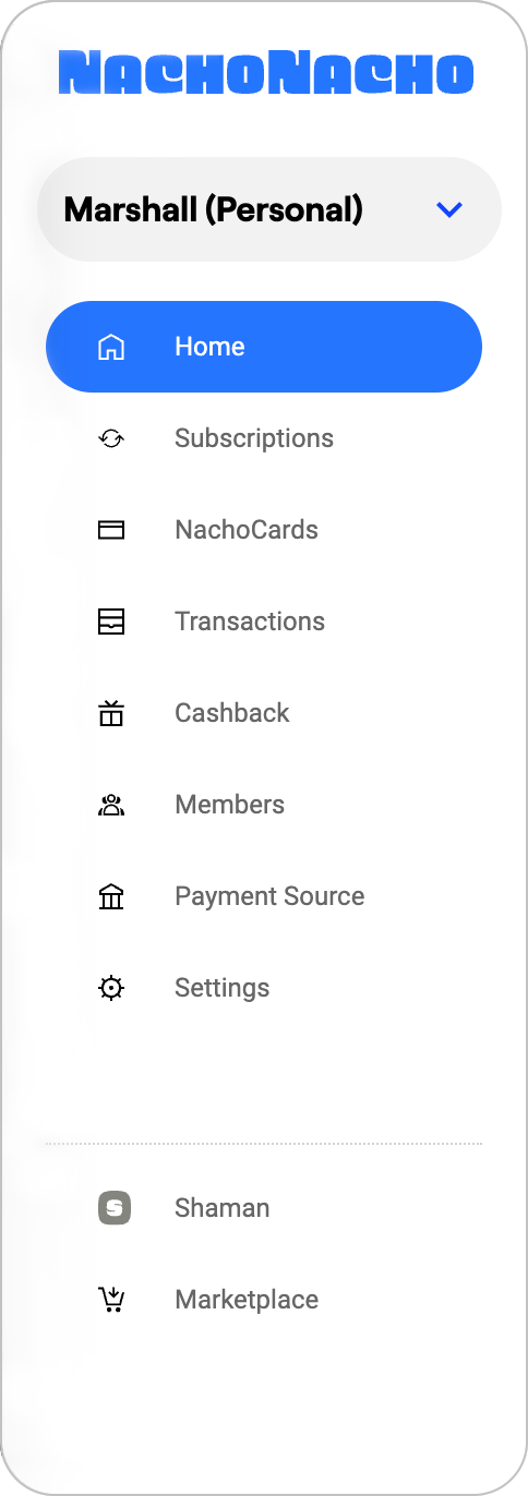
A major UI concern tackled here is creating a distinction between two instances of a user account:
Users needed easy access to change between accounts while having access to their main user profile that their login is linked to.
Wireframed new features and main UI ︎︎︎
[top nav bar, card styling, buttons, and side menu]
Created high fidelity mockups with alternative design solutions for A/B testing
A major UI concern tackled here is creating a distinction between two instances of a user account:
- Their profile (top left of top nav)
- Their personal/company account view
(listed under the logo)
Users needed easy access to change between accounts while having access to their main user profile that their login is linked to.

4. Launch
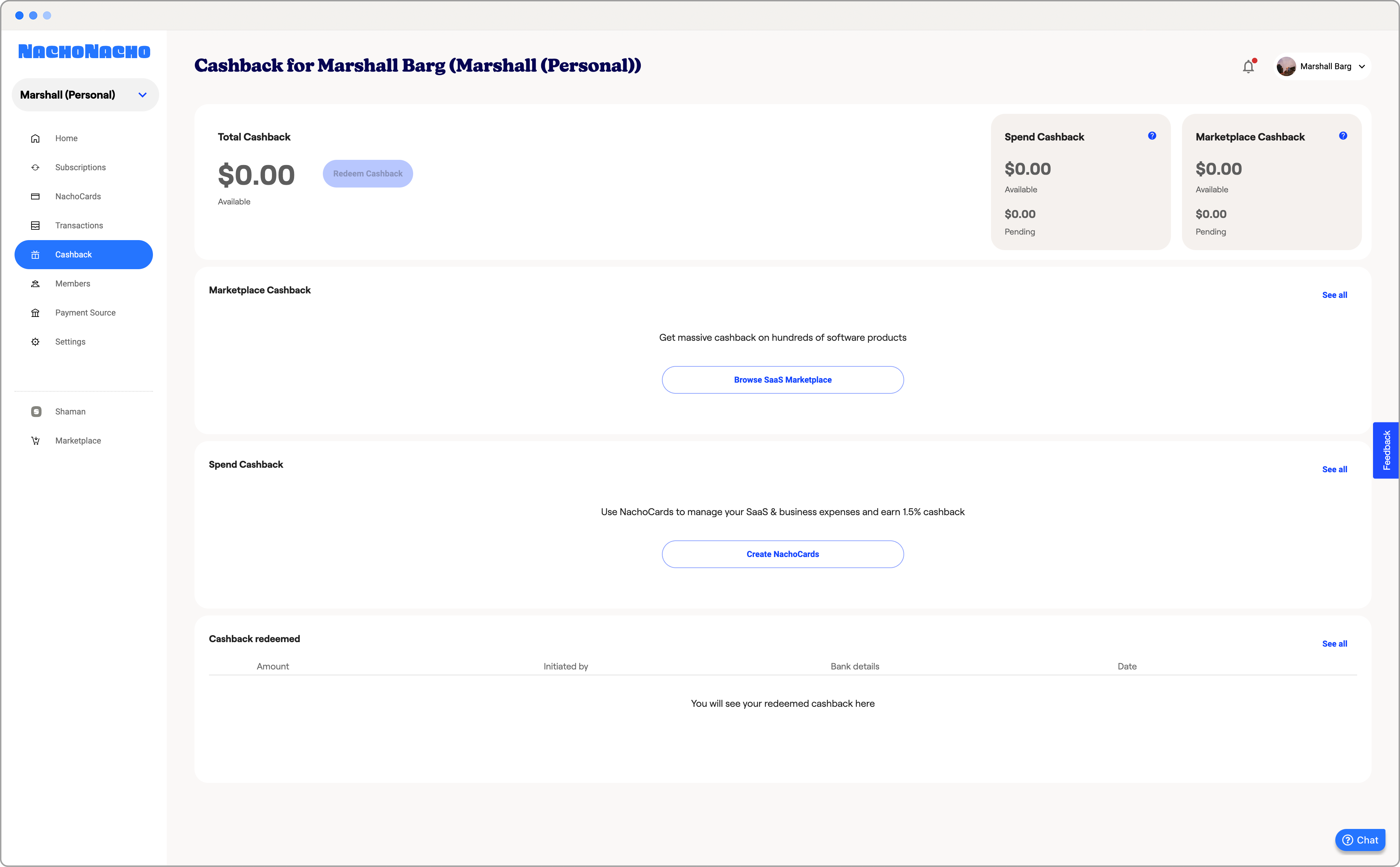
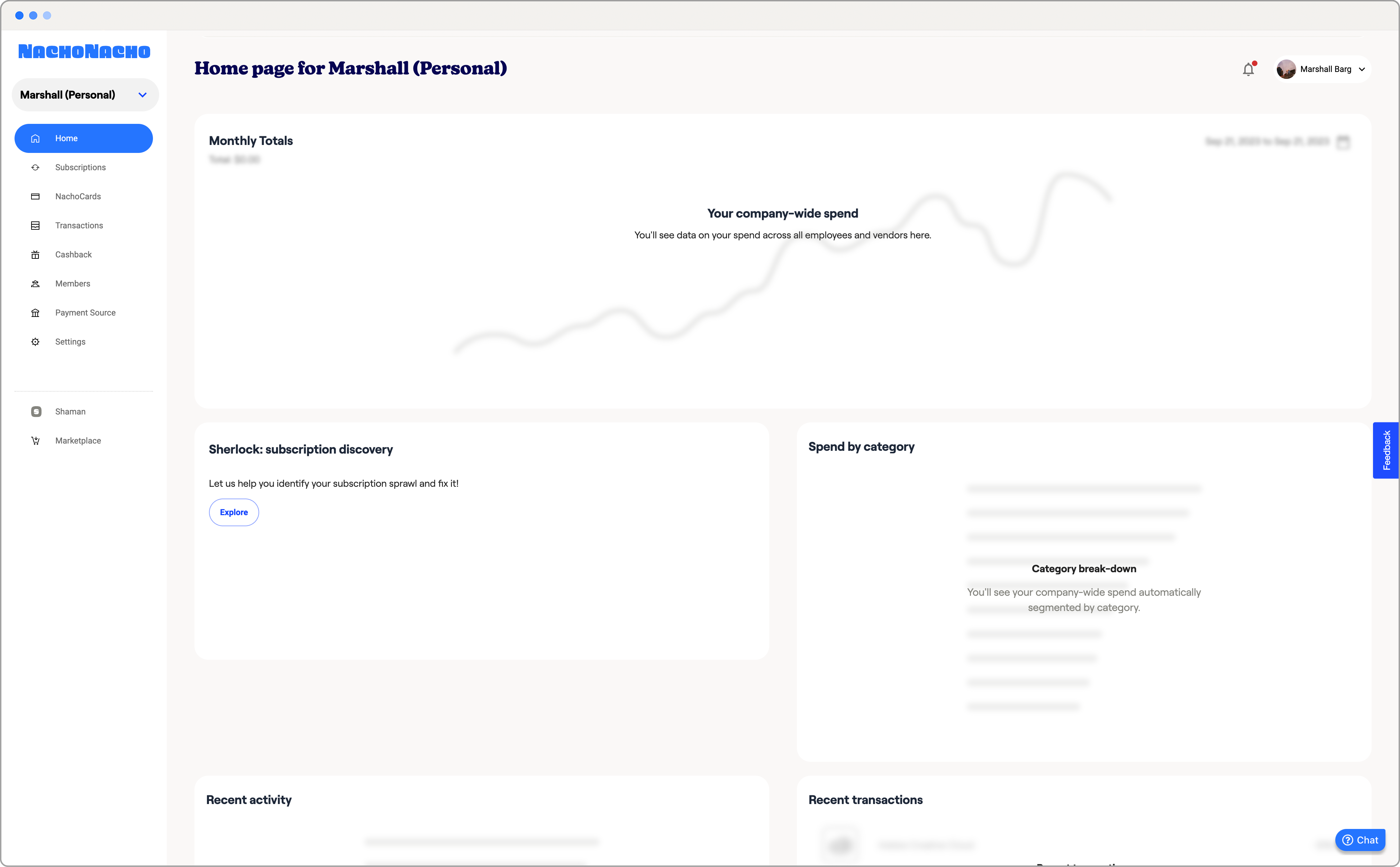
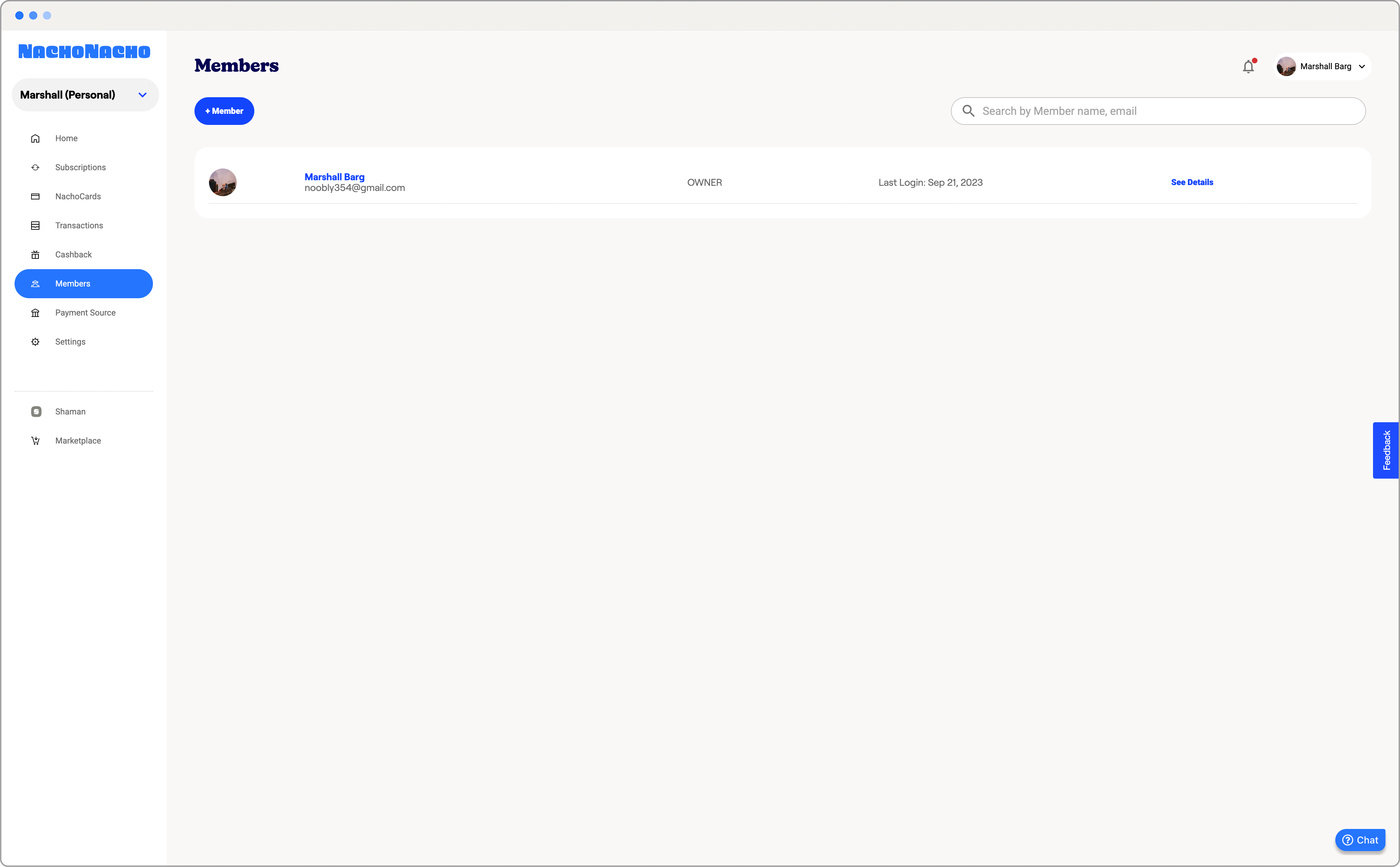

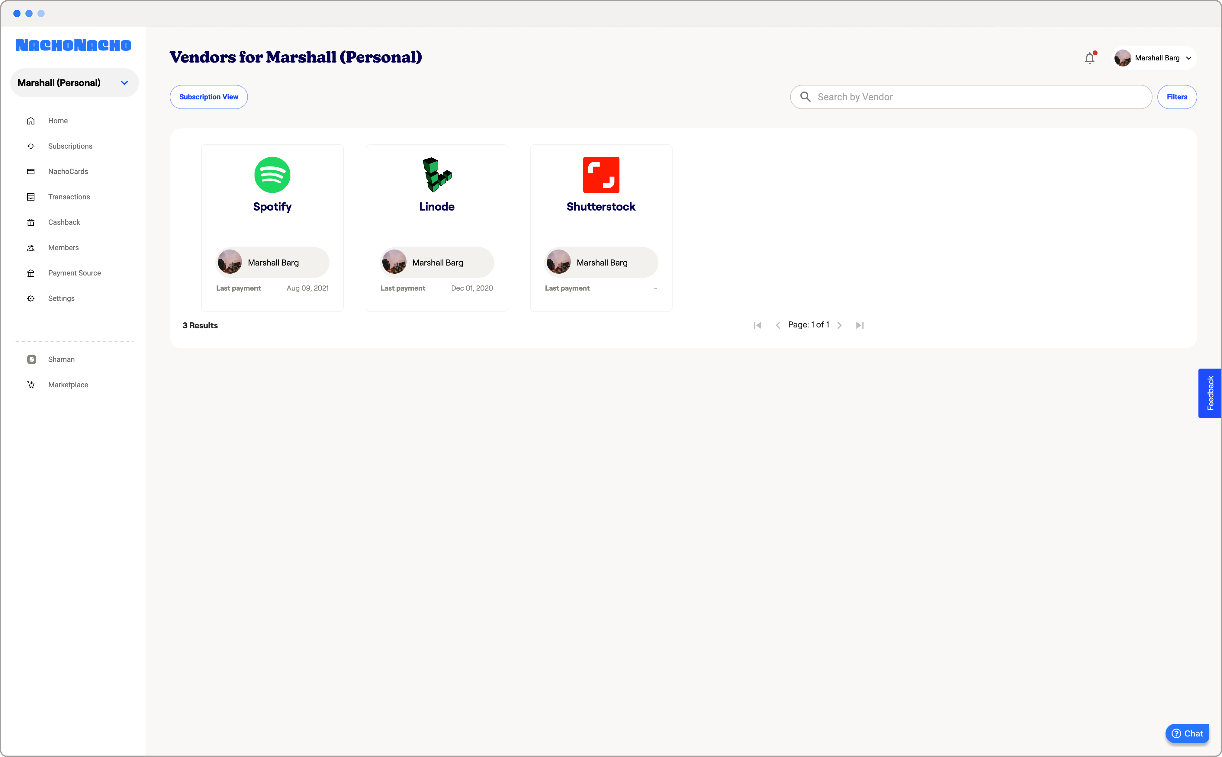
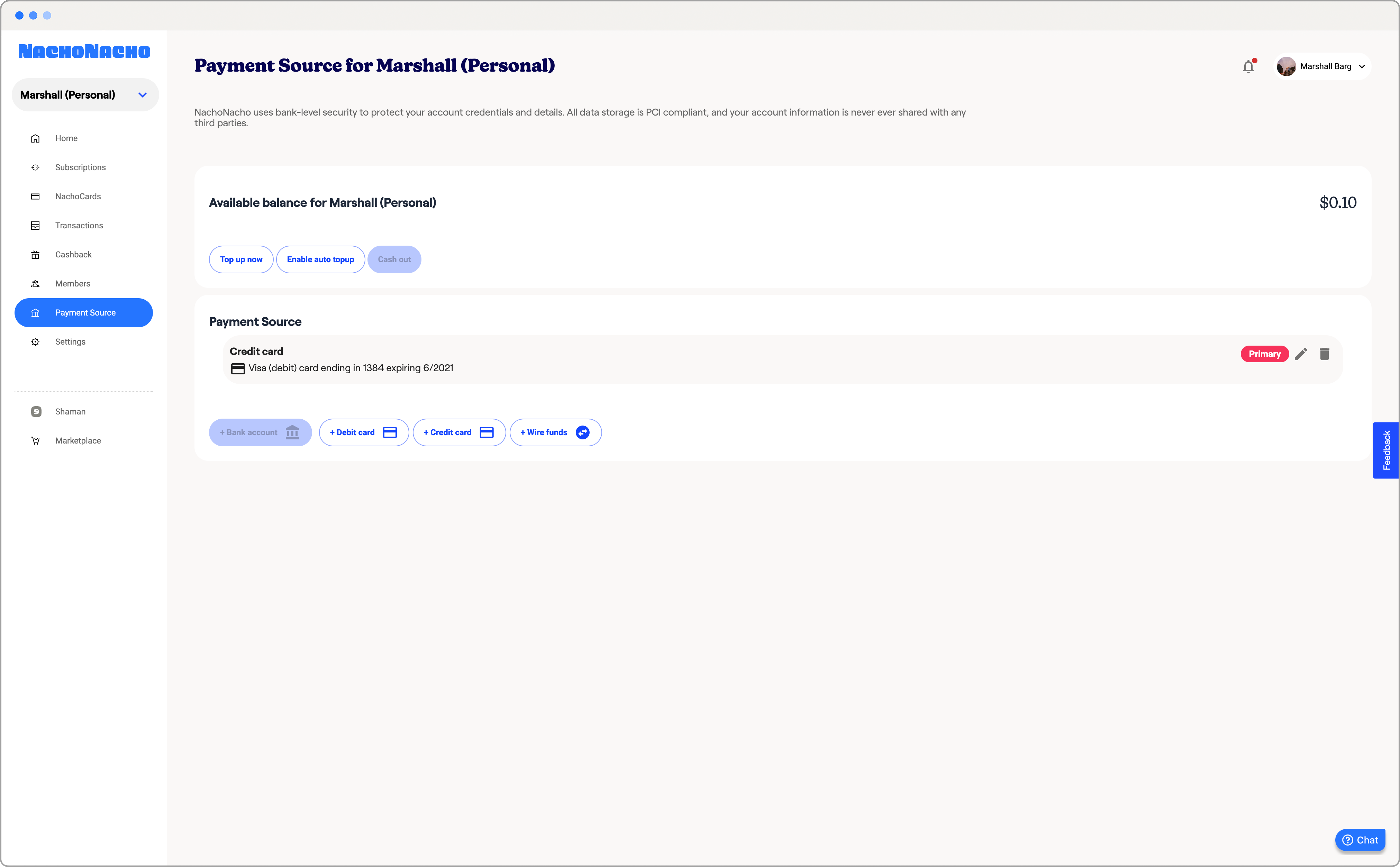
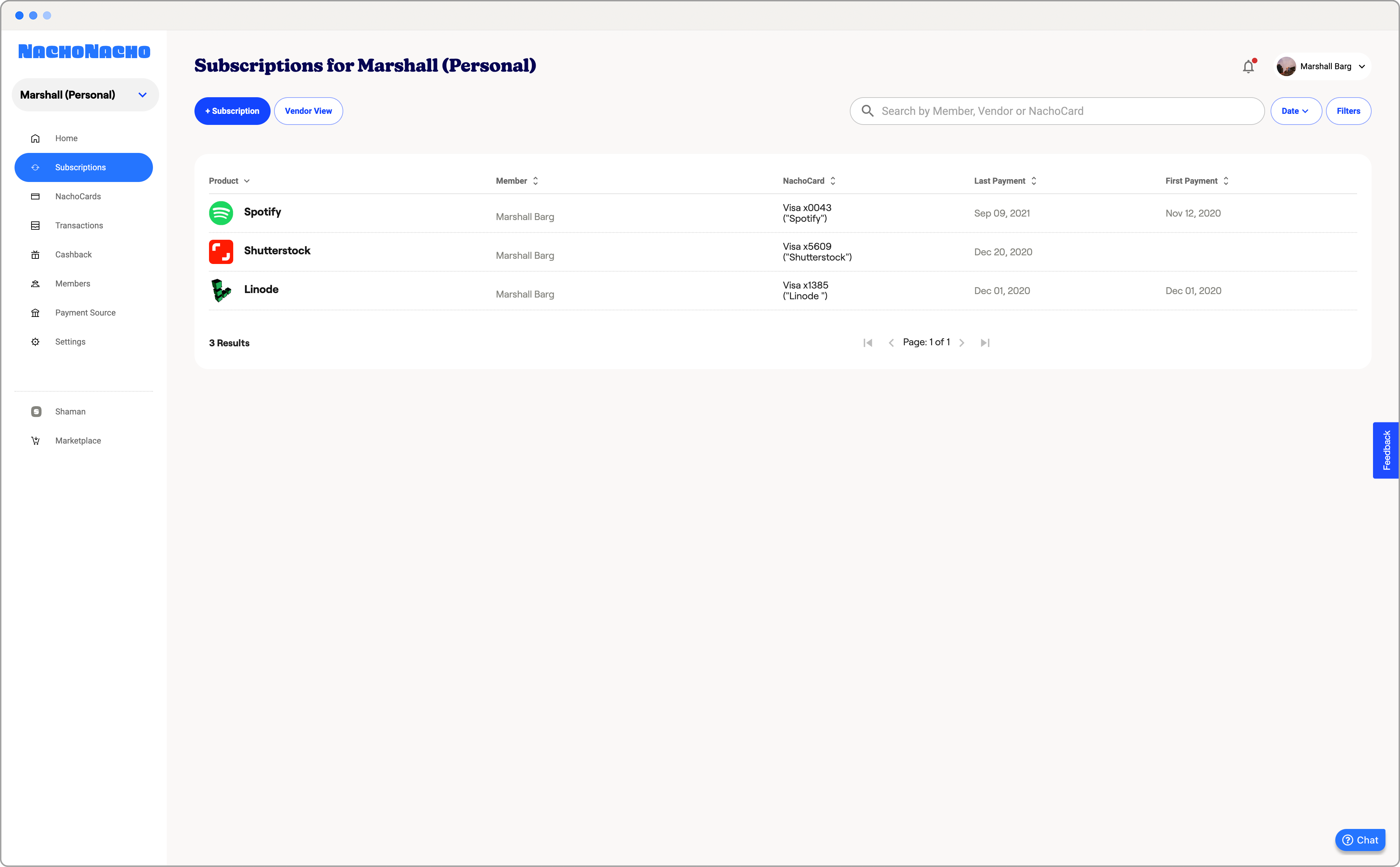

Launched each page and oversaw finetuning of design with the CFO.
Qualitative Results:
Qunatitative Results:
Despite a redesign post-funding, the layout, card styling and placement, as well as the type design of information on cards have all remained consistent with the designs I helped launch.
Qualitative Results:
- CEO noted a lower frequency of pointing out buttons and actionables during demos.
Qunatitative Results:
-
Click heat maps indicated higher concentrations around buttons and actionables than idling in negative space.
- Fewer chat requests pertaining to UI questions post-redesign.
Despite a redesign post-funding, the layout, card styling and placement, as well as the type design of information on cards have all remained consistent with the designs I helped launch.
DESIGN SPECIFICS︎︎︎DESIGN SPECIFICS︎︎︎ DESIGN SPECIFICS︎︎︎ DESIGN SPECIFICS︎︎︎DESIGN SPECIFICS︎︎︎
[Overarching Branding Focus]
-
Empahsize affilaiate branding
- Update company's active voice
- Define and delineate market value for consumers and businesses
[Outcomes]
-
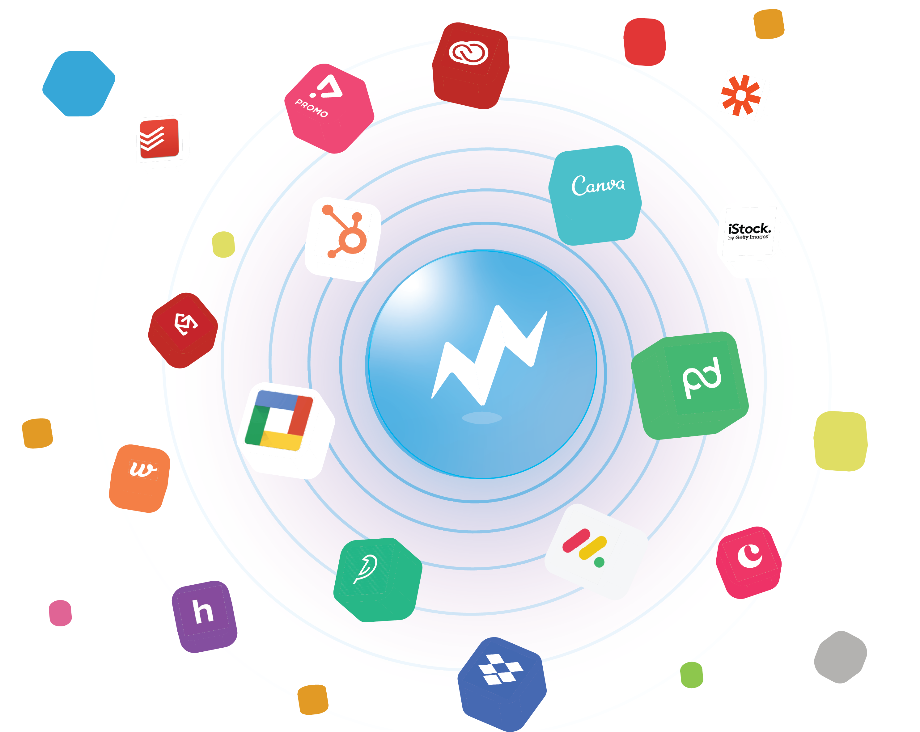
Developed cube/card stylings with SaaS vendor logos
[increasing visibility for affiliate marketing]
[enhances repubaility]
- Phased out orange and blue color scheme for lower contrast blues and hints of purple
- Built out asset library with various marketing and branding images
- Developed buyer and seller pages with unique illustrations
- Expanded various pages to focus on different company goals
- Formulated copy representing both sides of the company
Additonal Design Examples︎︎︎Additonal Design Examples︎︎︎Additonal Design Examples︎︎︎Additonal Design Examples︎︎︎Additonal Design Examples︎︎︎
[Icons]
![]()
![]()
![]()
![]()
![]()
![]()
![]()
![]()







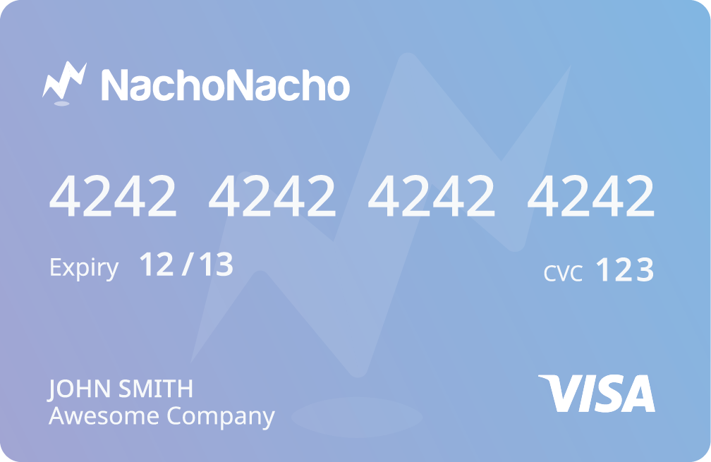
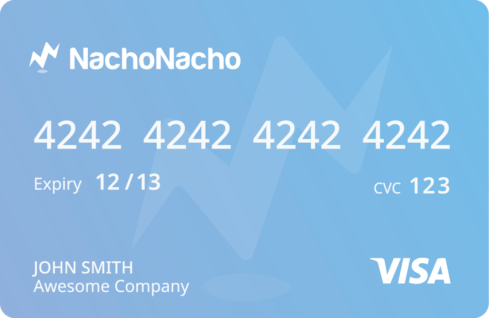
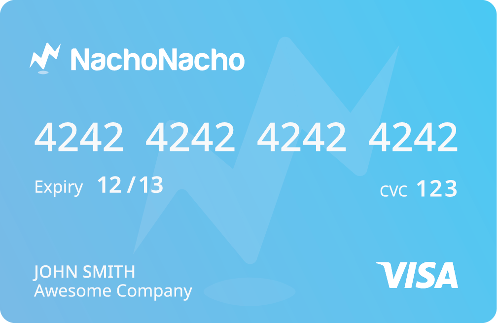
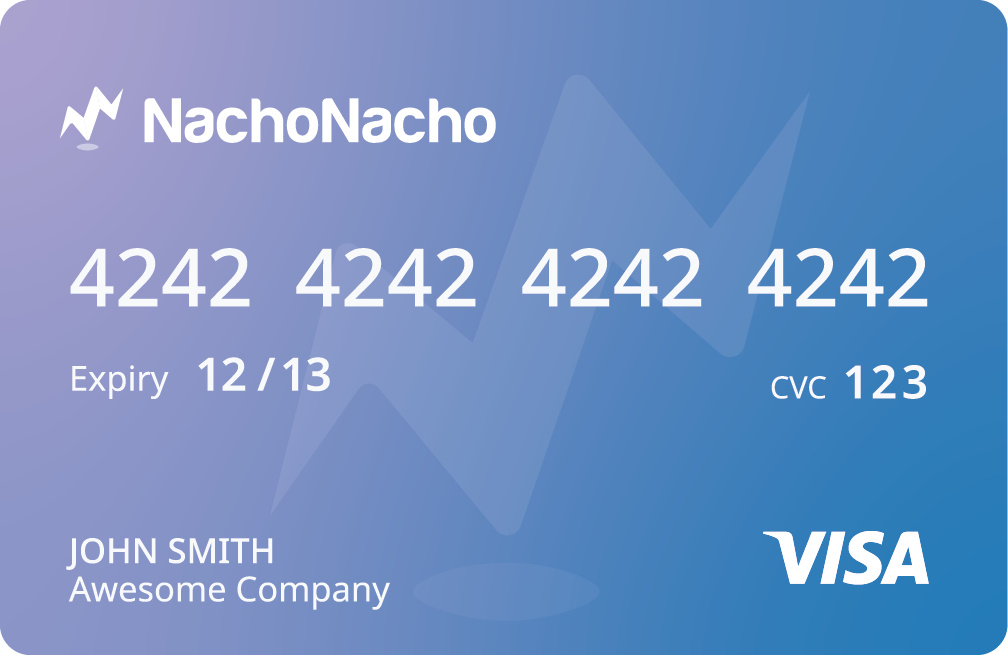
[NachoCards]
![]()
![]()
![]()
![]()
![]()
![]()
![]()
